A street for everyone
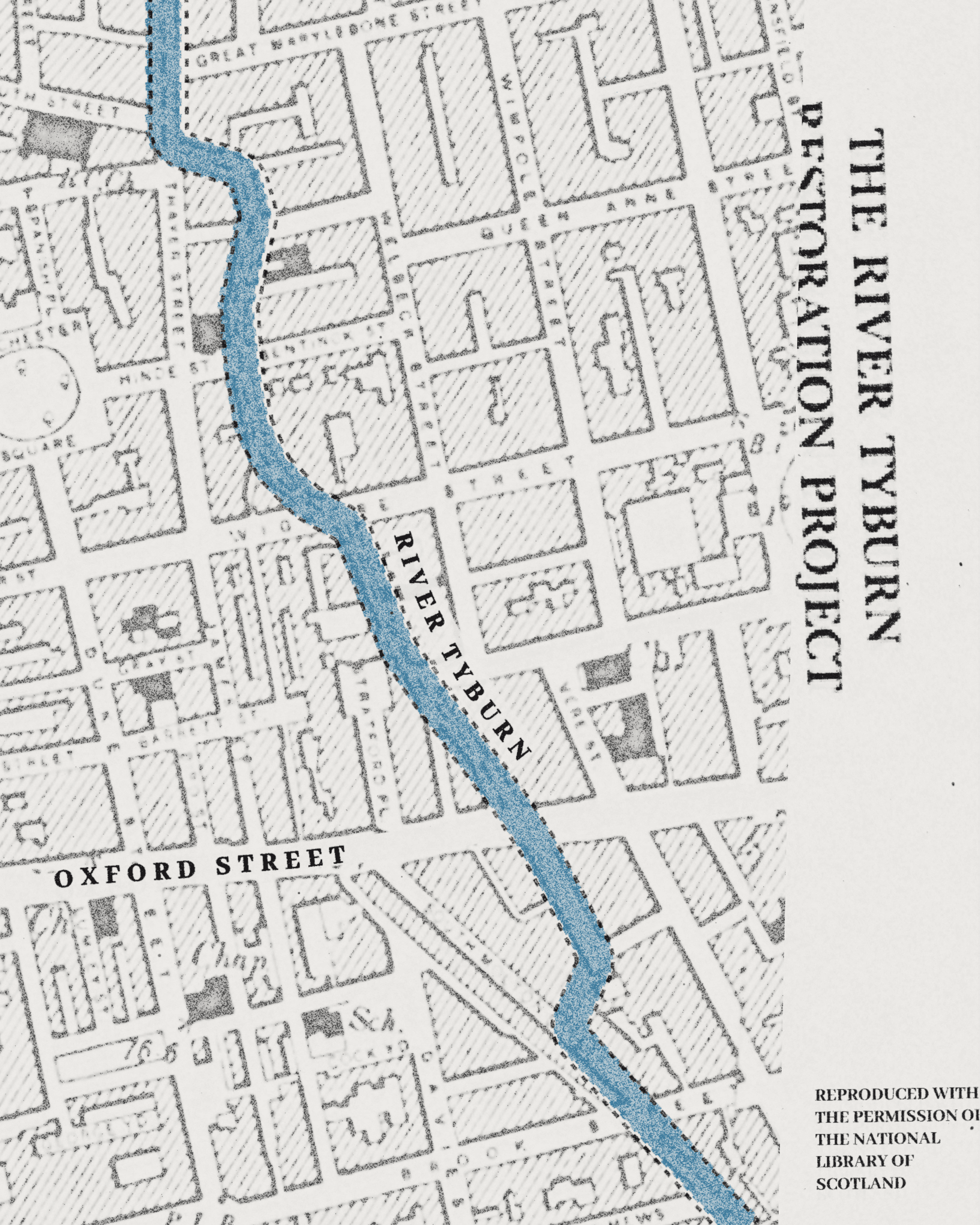
Oxford Street has never stood still. From a Roman road to one of the world’s most famous shopping destinations, it’s constantly changed with the times. And now, as pedestrianisation ushers in its next chapter, we’ve created an identity that can evolve with it. One that celebrates the street’s past, embraces its present and looks forward to a more open, welcoming future. A place for everyone, whatever brings them here.
Strategy
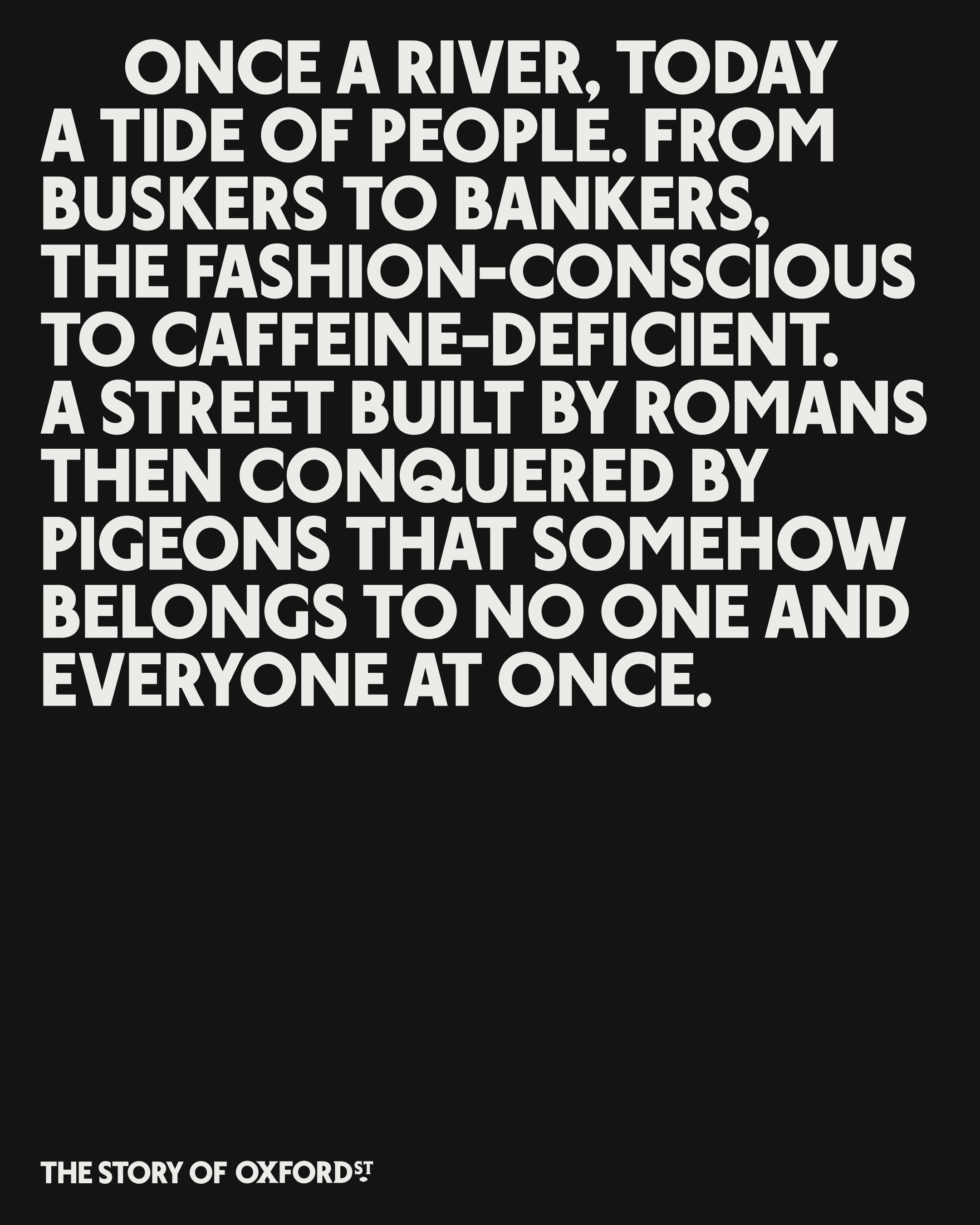
Writing in 1932, Virginia Woolf once compared Oxford Street to a tide of people. Almost a century later, it’s an observation that still rings true. We wanted to create a brand that felt like part of the crowd, rather than an authority looking on. One that knows when to make a bit of noise and add to the drama, and when to step aside and let the street do the talking. We captured this in one simple idea: Oxford Street for everyone.
Identity
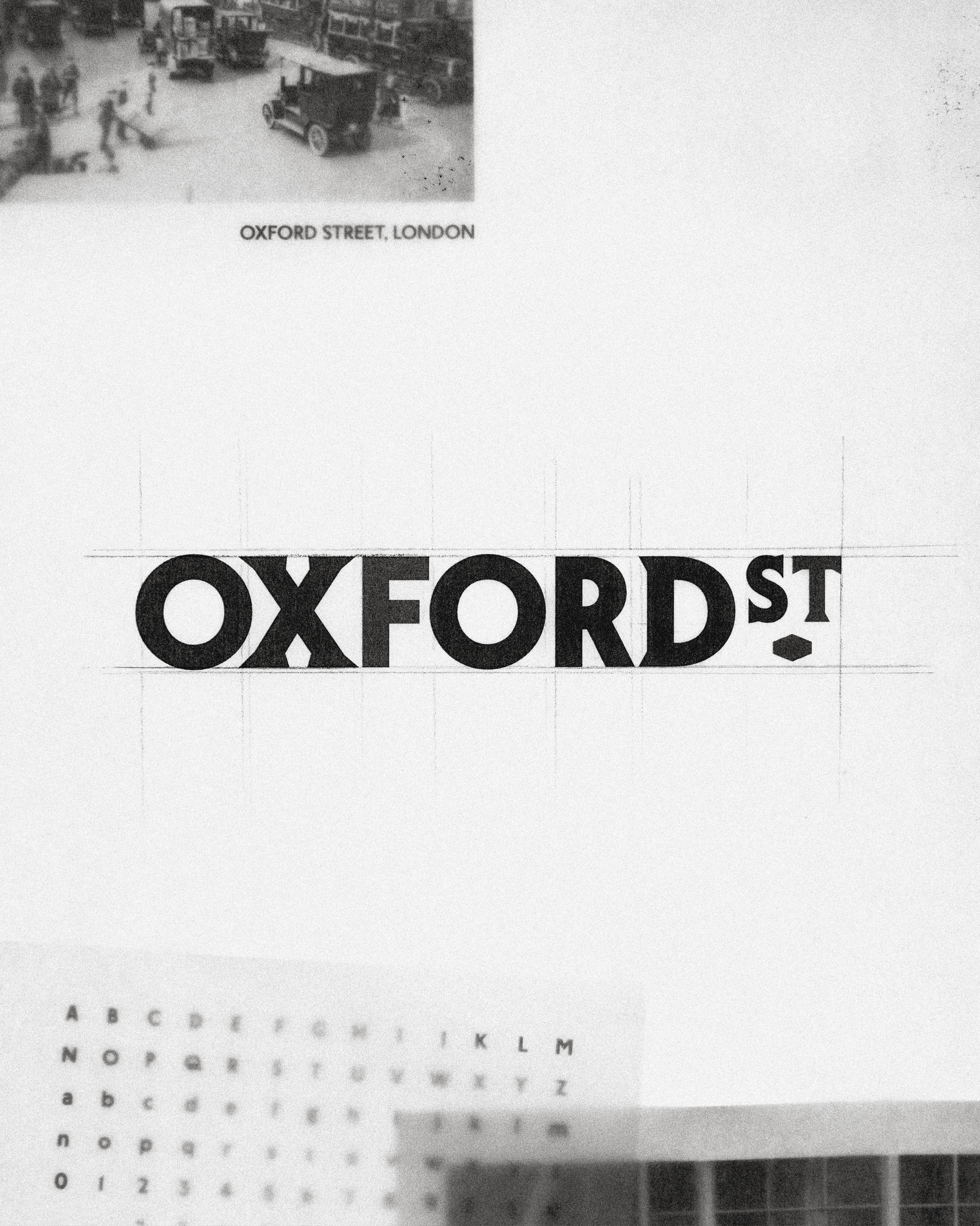
Inspired by London’s rich typographic heritage, we created London Sans, a contemporary typeface with a distinctly local character. The wordmark pairs it with a contrasting serif and a distinctive lozenge, drawing on the visual language of the street’s historic signage. Across the identity, typography flows and meanders, echoing the movement of the crowds. We also created a monogram inspired by local architecture and shop signs, with intersecting letters that reflect the street’s constant activity.
Interactive
Interactive
Art Direction
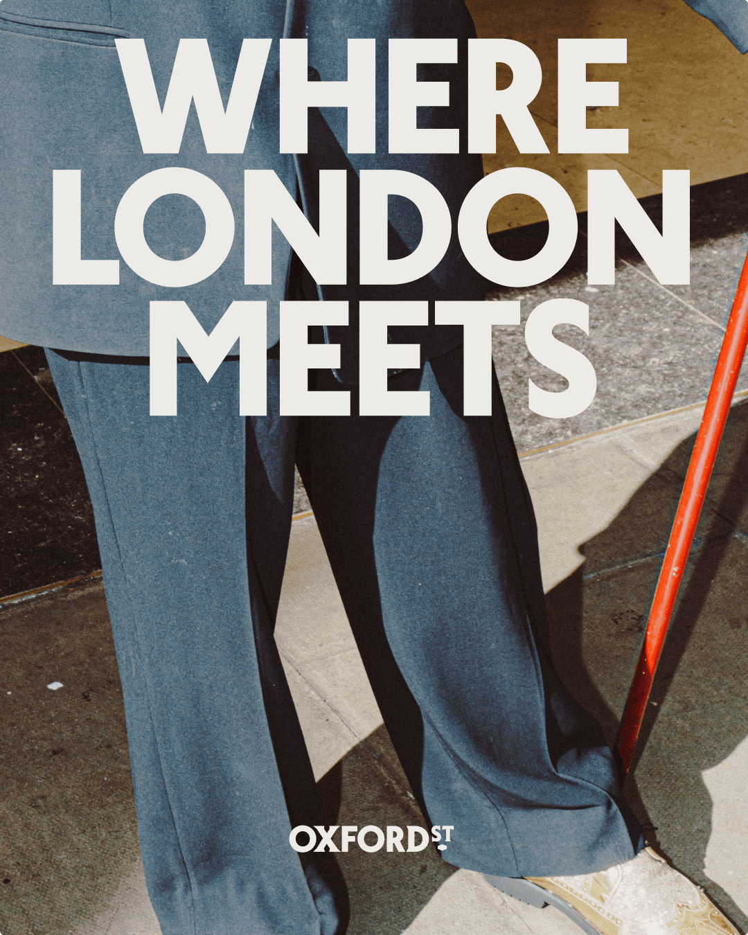
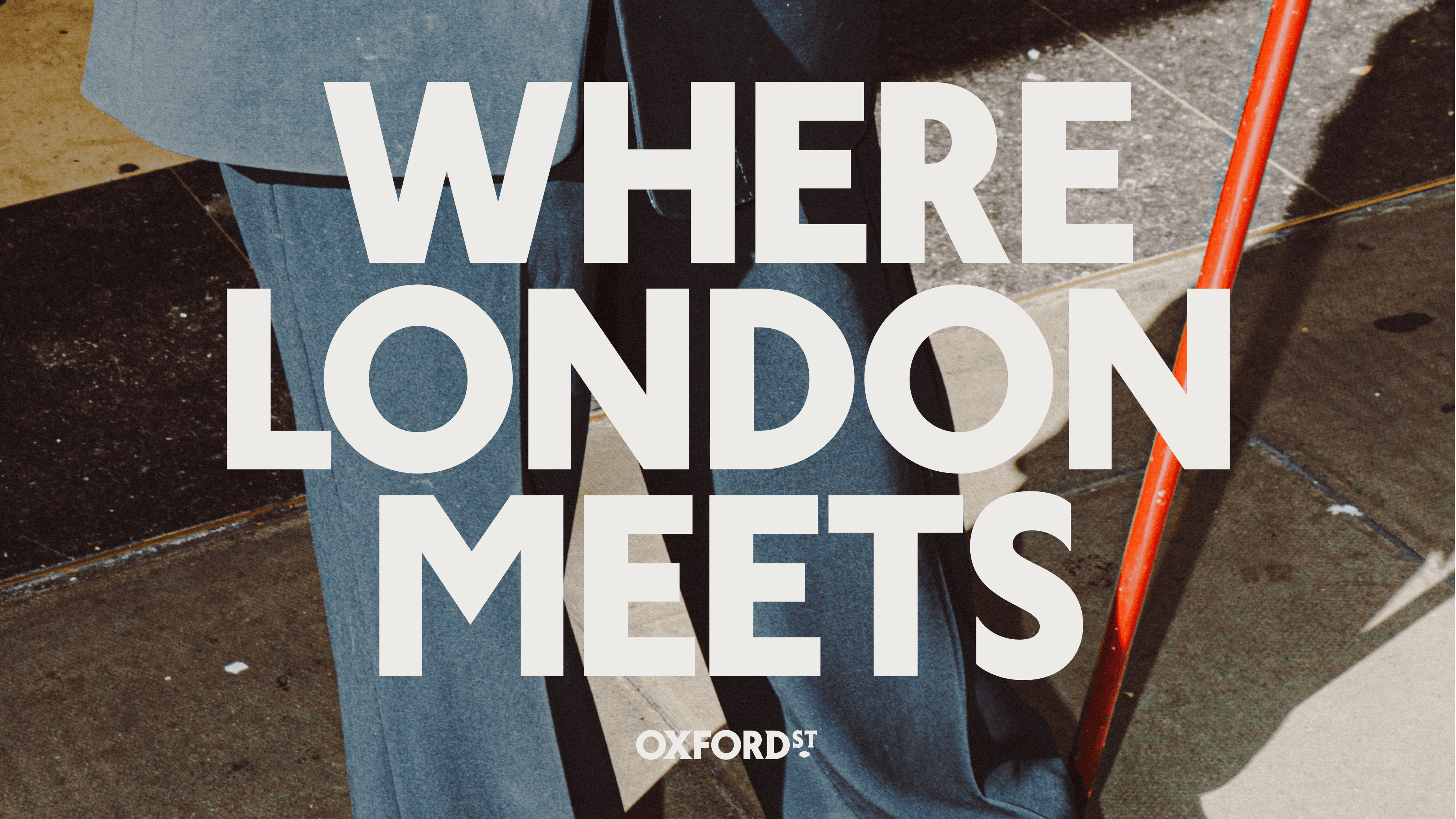
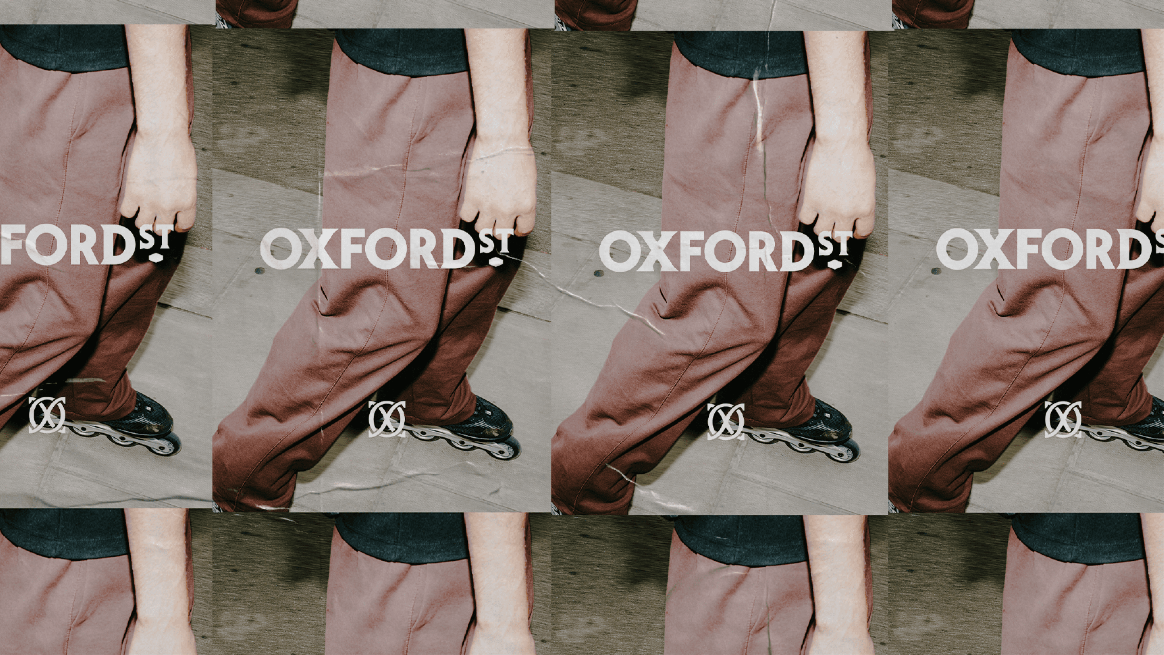
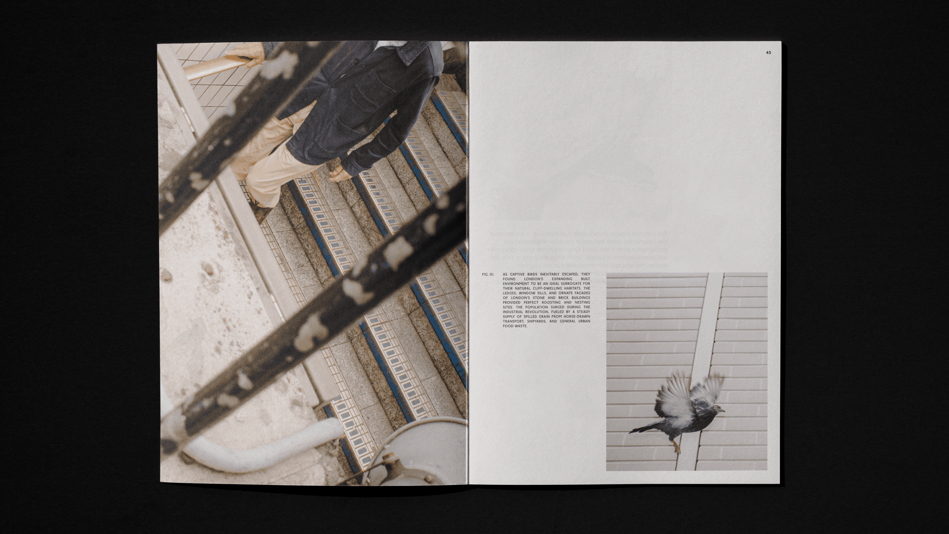
Our art direction takes an honest, unfiltered look at life on Oxford Street. Candid and observational, it captures the familiar faces, fleeting encounters and everyday moments that often go unnoticed.
Interactive
Campaign
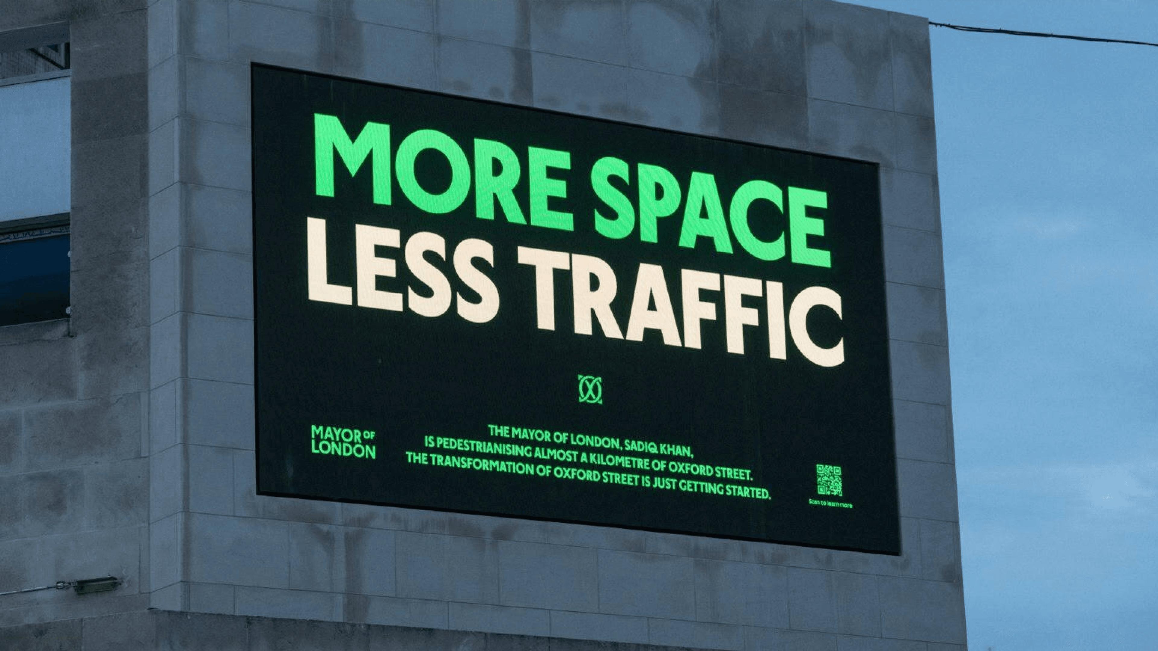
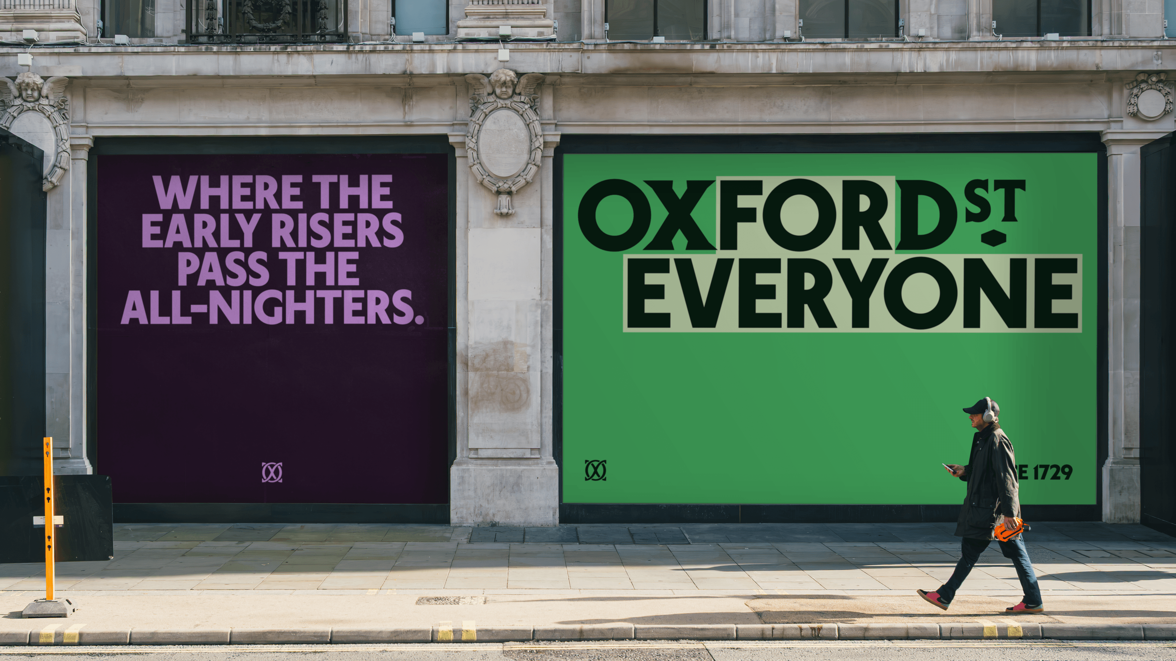
For the campaign, we brought the idea of ‘Oxford Street for everyone’ to life through a flexible copy mechanic. A series of headlines find humour and personality in the street’s eclectic reputation. From everyday routines to unexpected encounters, the campaign celebrates the countless ways people experience Oxford Street, capturing its energy, spontaneity and variety.
Interactive
Wayfinding
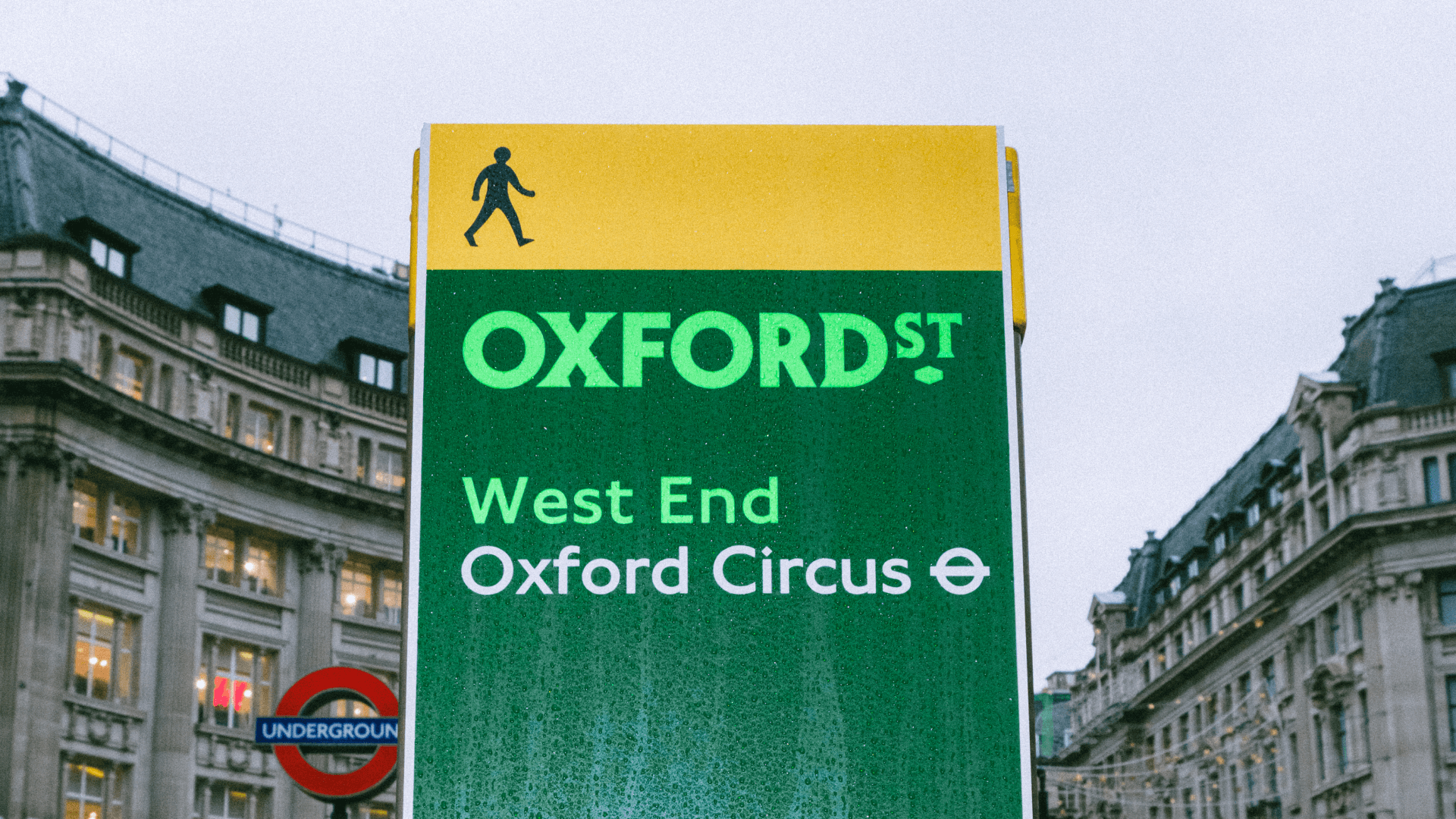
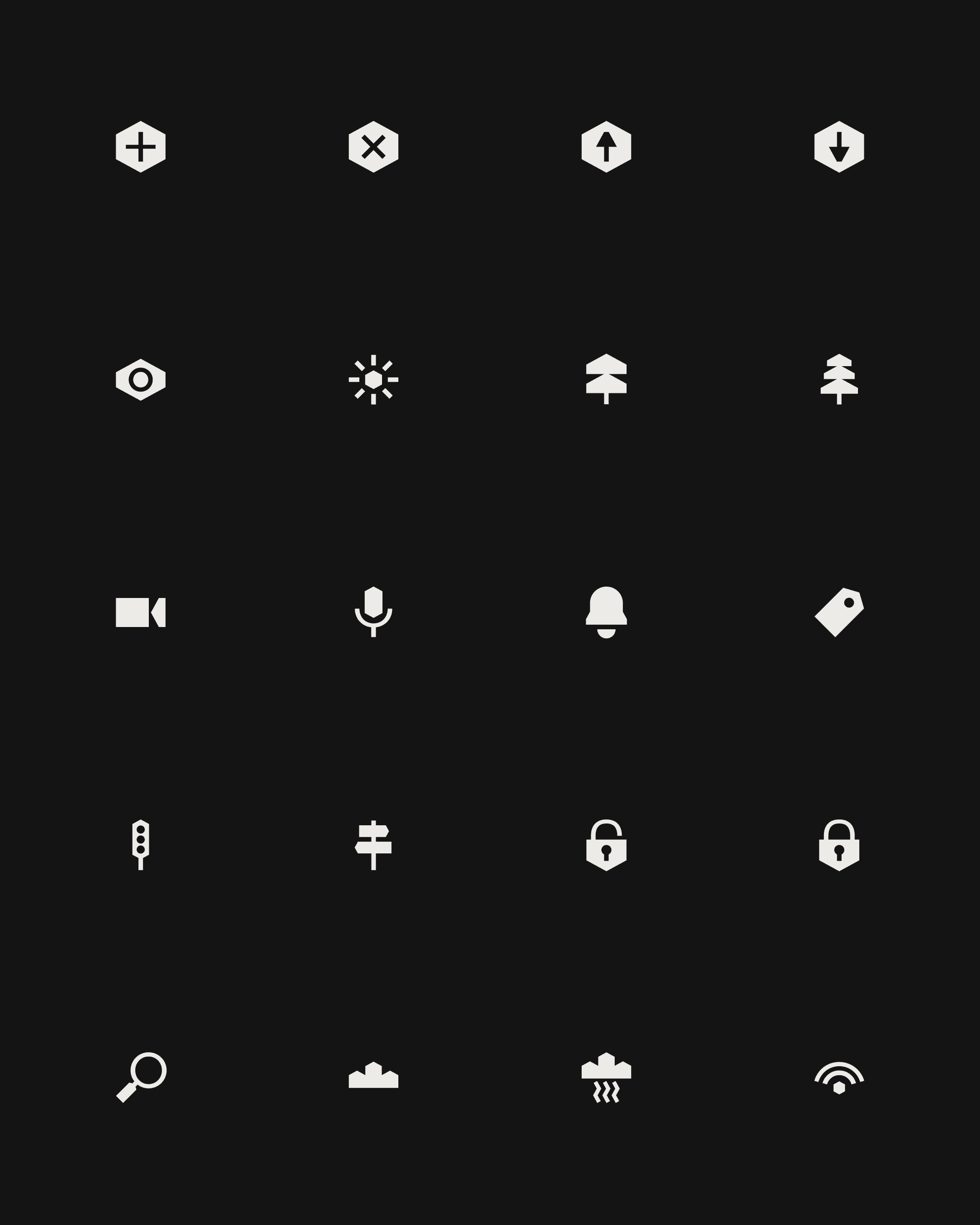
We created a family of icons inspired by the familiar sights and symbols of Oxford Street. Simple and characterful, they make navigating the area more intuitive while adding another layer of expression to the identity.
Outcome
As Oxford Street enters a new era, the identity is designed to move with it. A flexible system that can grow and evolve alongside the street, celebrating its rich history while making room for new experiences, new possibilities and a new generation of visitors.